Wordmarks
The Stanford wordmark is uniquely drawn and is the primary logo for the university.
Treat the signature as artwork, not as typography or a font. It cannot be accurately reproduced with any typeface and should not be modified in any way.
Wordmark logo colors
University-approved colors shown below must be used for logos and matched for all digital projects, print and promotional items.
Cardinal red
Pantone 201 C
White
N/A
Black
Process black
University wordmark

Full university wordmark
![]()
Stacked university wordmark

Primary usage

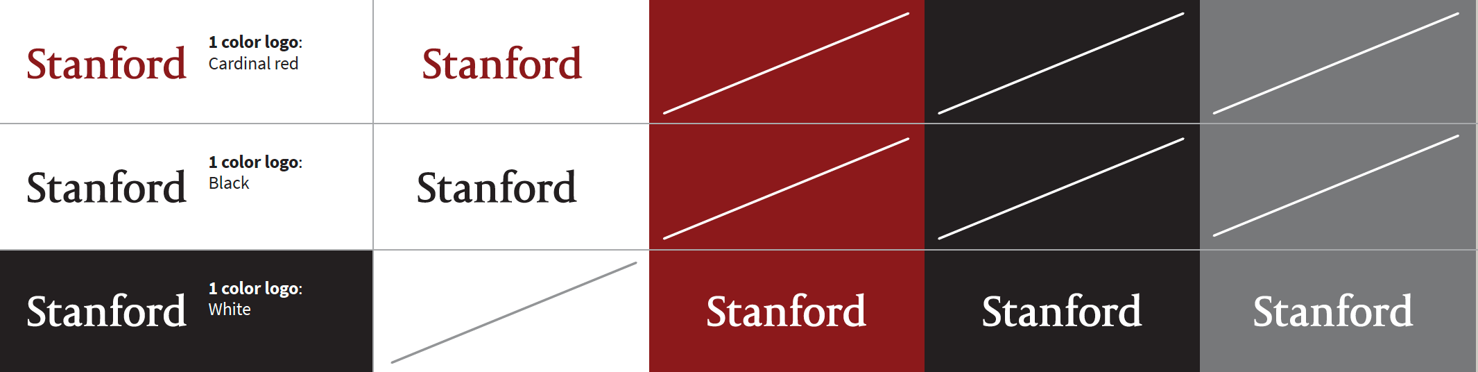
The primary color options for our logos are Cardinal red/PMS 201 or reversed out in white.
Use the Cardinal red option on lighter backgrounds and the reversed option on darker backgrounds for maximum legibility.
Secondary use

For secondary usage black-and-white and grayscale scenarios the black version of the logo is acceptable.
Stanford wordmark do’s and don’ts
Do
Use correct color/background combinations.
The Stanford wordmark should be reproduced in the colors and color combinations shown below.
Download the art sheet which shows correct color combinations for production of the Stanford block S with tree here (link to pdf).
Make it large enough to read.
Always make the wordmark at least .85 inch for print and 85 pixels for digital applications so that they are reproduced at a size where they are clearly legible.
Small merchandise such as pens and pins require particular attention to the minimum size. If the minimum size cannot be met, the logo is unreadable.
The logo may need to be larger when they are reproduced via low-resolution media such as on websites or in presentations in order to retain design integrity.
Example

Give it enough room to breathe.
There should always be a buffer zone surrounding the wordmark, with no type or graphics appearing in the zone. At a minimum, the space should be equal to the x-height of “Stanford” at any given size and extend above, below, to the left and to the right of the logo.
![]()
Do not place other graphics or typography in the minimum clear space area, except for trademark designations when appropriate.
Clear space is particularly important when the Stanford wordmark is being used alongside other logos. The clear space allows all the logos to breathe and the communication to be more digestible.
Don’t
The wordmark and signatures should not be altered in any way, such as extending, condensing, outlining, adding borders, special effects or drop shadows, or attaching other words or graphics.
The graphics below are a few examples of incorrect usage and alterations of the Stanford wordmark. Please avoid these and all other changes.