Typography
Our visual communications use families of typefaces that work together to bring Stanford’s story to life. They each have their own strengths. Use the following sections to guide your typographic choices, when to use them and how to style them.
At Stanford, we use two primary typefaces:
- Source Sans 3
- Source Serif 4
These typefaces work together to bring our messages to life. Using our brand typefaces consistently and thoughtfully is important for a cohesive brand presence.
We also have four accent typefaces:
- Roboto
- Roboto Condensed
- Roboto Mono Spaced
- Roboto Slab
Roboto is an alternate font family to Source Sans Pro and is suitable for technical layouts, for more economical use of space in layouts that require more information or content or when you want to convey a strong sense of structure and numerical data.
You can download all the above fonts on Google Fonts.
System Fonts
Our identity typefaces above may not always be available to everyone. When collaborating with multiple people or sharing templates, you may use the alternate fonts, which are freely available on all computers.
Using type
Using type thoughtfully is crucial to making our designs professional and easy to read. Follow these tips to make sure our typography is consistent.
Leading
Line spacing, called leading, is critical to setting professional-looking type that is easy to read. Leading should be set tight, but not too tight.
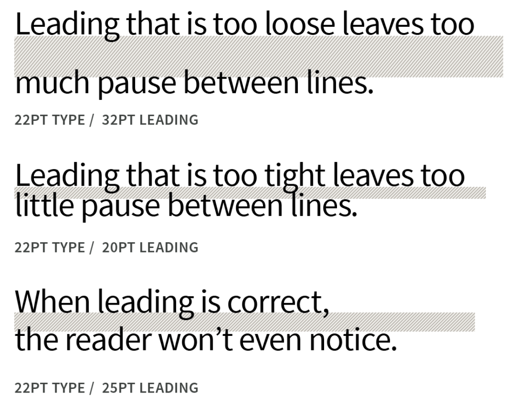
A good rule of thumb is to start with leading that is 2–4 points higher than the point size of the text. This won’t always be right, but leading can most easily be adjusted from there.
Tracking
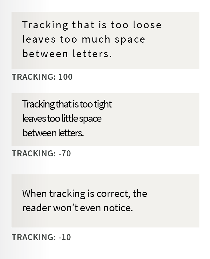
Correct letterspacing, called tracking, also helps to make the type easy to read. Always use optical kerning, and rely on your best judgment when tracking text or kerning characters, based on this guide.
Using type creatively
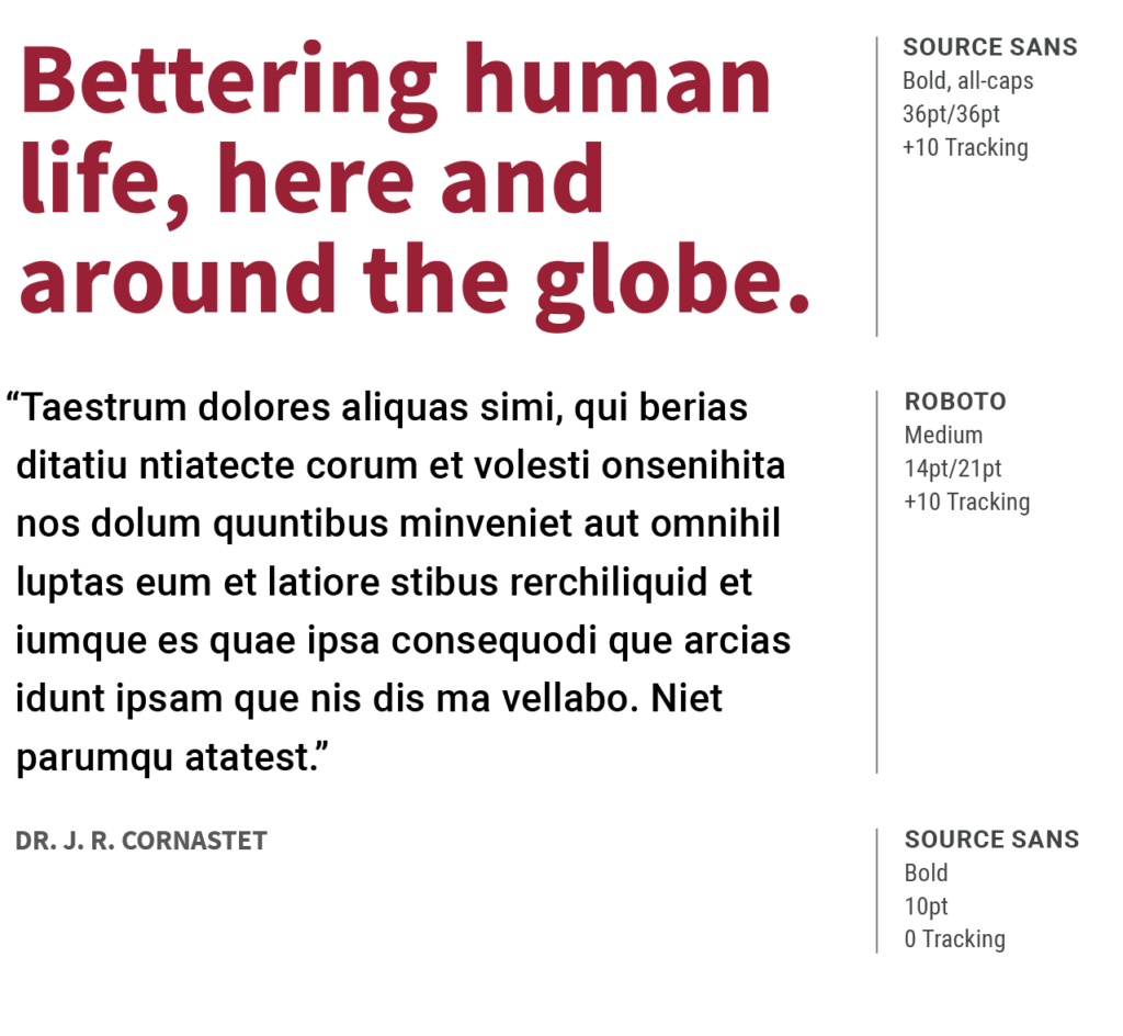
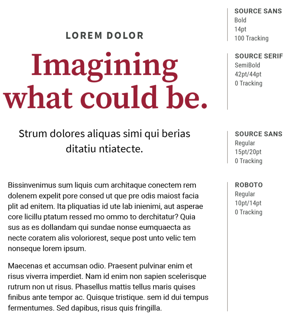
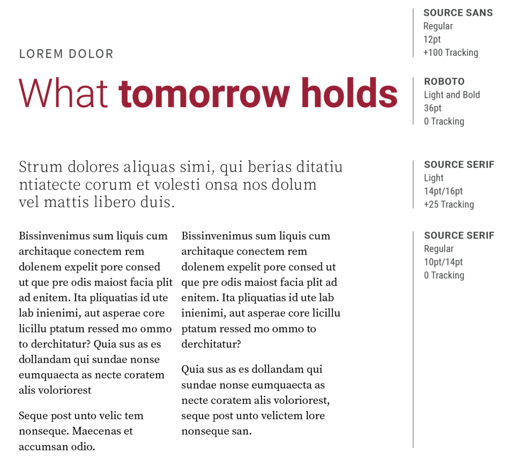
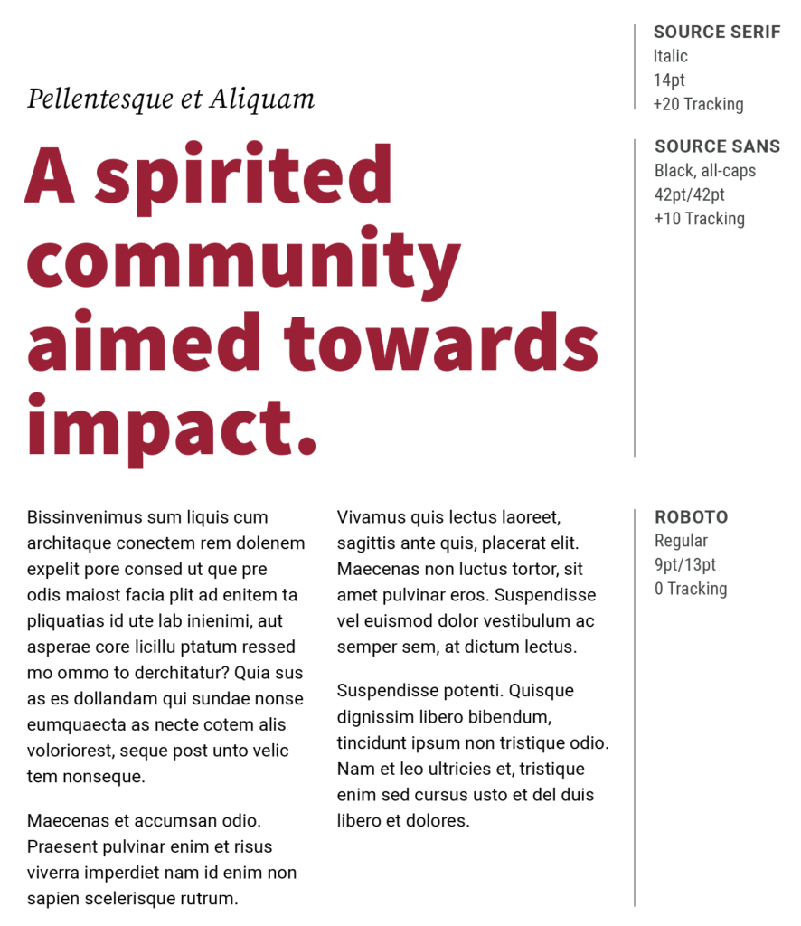
The samples below illustrate type combinations that work well together. Specifications for these examples are good starting points, but they can change depending on the format of the piece.
