Combinations
The Stanford University wordmark and signature system may be compatible with existing university emblems—the university seal and the block S with tree.
In general, the seal reads best in formal and academic correspondence and materials. The block S with tree is recommended for most other communications.
Logo colors
University-approved colors shown below must be used for logos and matched for all digital projects, print and promotional items.
Cardinal red
Pantone 201 C
White
N/A
Black
Process black
Grey
Cool grey 11C
Palo Alto green
Pantone 3298 C
Combination logo do’s and don’ts
Do
Use correct color/background combinations.
Stanford combination logos should be reproduced in the colors and color combinations shown below.
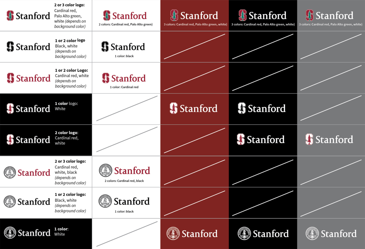
Download the art sheet which shows correct color combinations for production of the Stanford Block S with Tree here (link to pdf).
Use the correct logo
Use the Wordmark + Seal for formal applications

Use the Wordmark + Block S w/ Tree for less formal applications

Give it room to breathe
Give the marks enough free space to breathe—at least the x-height of “Stanford” on all sides
Make it large enough to read
Always make the Stanford wordmark in the combination at least .85 inch for print and 85 pixels for digital applications so that they are reproduced at a size where they are clearly legible.
Small merchandise such as pens and pins require particular attention to the minimum size. If the minimum size cannot be met, the logo is unreadable.
For digital and low resolution applications, you may need to make it larger than the minimum so it’s readable.
Don’t
- Don’t combine the marks in different ways than provided.
- Don’t reproduce the marks too small such that they are not clearly readable.
- Don’t put anything (including the edge of your design) too close to the combo marks.