Color
Color is one of the most powerful aspects of our brand identity. Our color palette helps audiences identify us at a glance, and the way we use color sets the mood for each of our pieces. It reflects our heritage and our surroundings.
Primary colors

Our layouts lean heavily on the colors in our primary palette and you should use them, especially Cardinal red which has been Stanford’s official color since the university’s earliest days.
Consistently and appropriately using our primary identity colors is one of the most effective ways our communications can convey a recognizable Stanford feel.
Accent colors

Our accent colors are drawn from our main campus architecture and the California landscape. Feel free to combine and build custom secondary palettes that reflect the personality of your department, unit or group.
Web interactive colors

Our web interactive colors have been developed with digital use and accessibility standards in mind.
Color matching
University-approved colors Cardinal red (Pantone 201C) and Palo Alto green (Pantone 3298C) must be used for logos and matched for all digital projects, print and promotional items.
For digital files, use the RGB and/or HEX values listed in our primary and accent colors pages.
For print and promotional items, Stanford vendors must match approved Pantone colors listed above. The colors on this website are not intended to match Pantone color standards. For accurate color standards to match, refer to the current editions of Pantone color publications.
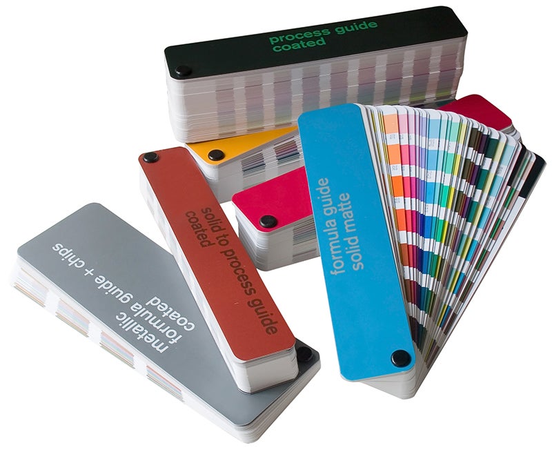
For ease of using the primary and accent palettes, you can download the corresponding Adobe Swatch Exchange file to assist in starting your projects. ASE files are compatible with Adobe Creative Suite:
Pantone or PMS colors are often used on promotional products where inks are mixed before screen printing.
CMYK color is combination of cyan, magenta, yellow, and black. Printers often present colors using CMYK color values — all litho and digital printing is printed in CMYK.
RGB color is created from red, green, and blue primary colors of light are added to reproduce a broad array of colors. This is the common color format of digital or on-screen files such as powerpoint or google slides.
Using color
The way we use color to reflect the Stanford identity sets the mood for each of our pieces. It reflects our heritage, our surroundings, and evokes emotion.
The chart below shows our university’s primary and accent colors placed on a grid with four categories that express attributes of creative work. This tool can be a guide for using color to convey a mood in a communication piece based on the project audience and message. You can use this grid as you evaluate other potential color combinations and choices for projects large and small.
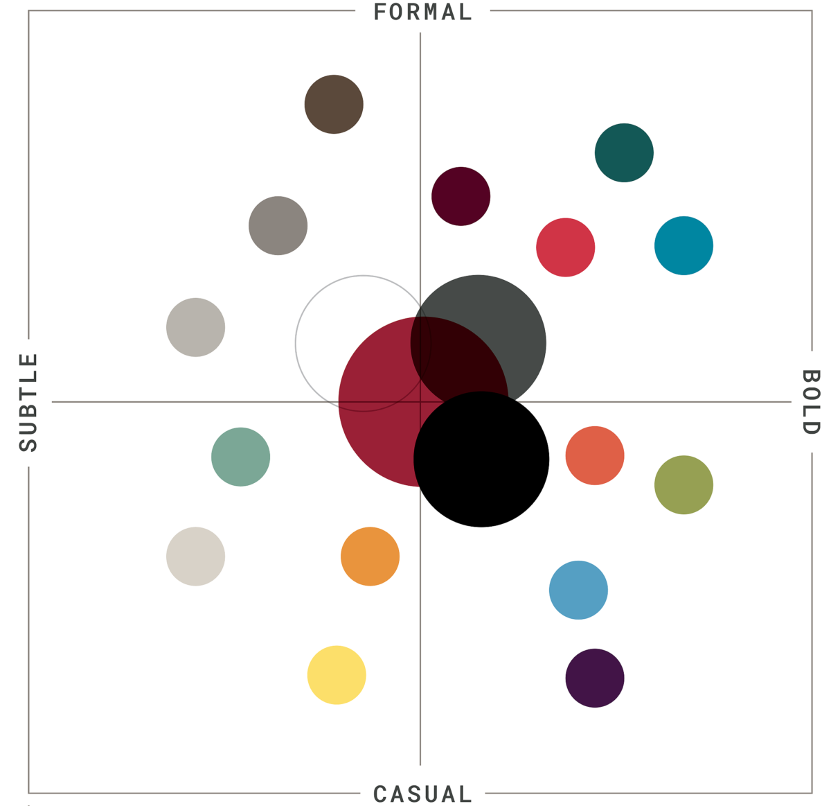
Color and mood spectrum
The four color applications below represent four different moods and examples of proportional representation one might use throughout a designed piece. Each color bar width indicates suggested use ratio in a given communication piece.
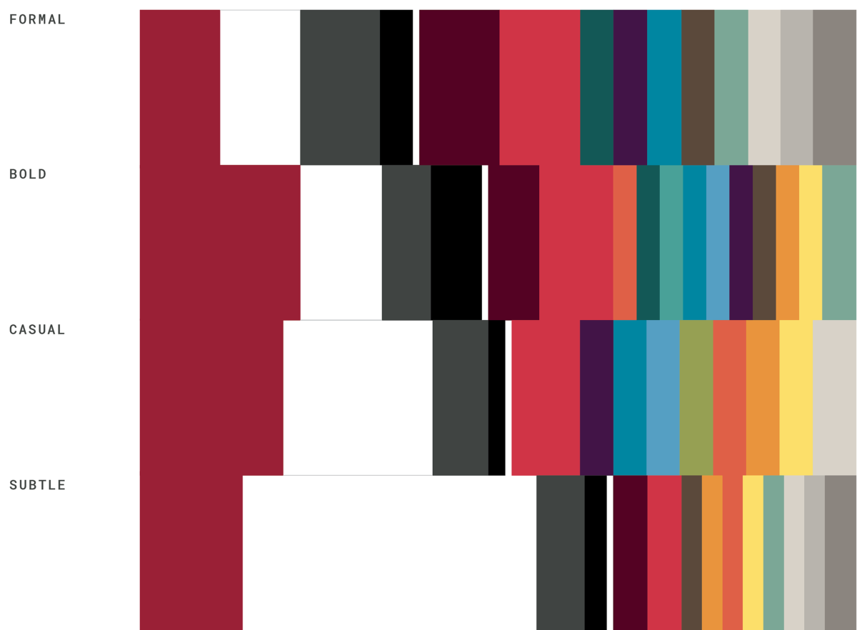
Color palette examples
The examples below show some general ratios for how much of each color can be used within a composition. Color palettes help us connect with various audiences and set the mood for each of our communication pieces.
Formal and bold
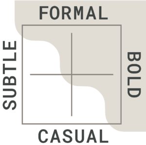
We’ve used the chart to the left to convey a set of example highlighted moods, in this case FORMAL and BOLD. The palette of Stanford primary and accent colors below reflect a sample suggested color palette.

Bold and casual
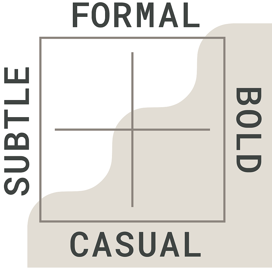
We’ve used the chart to the left to convey a set of example highlighted moods, in this case BOLD AND CASUAL. The palette of Stanford Primary and accent colors below reflect a sample suggested color palette.

Casual and subtle
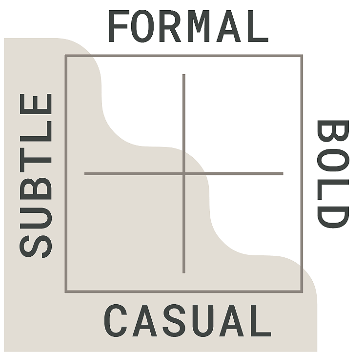
We’ve used the chart to the left to convey a set of example highlighted moods, in this case CASUAL AND SUBTLE. The palette of Stanford Primary and accent colors below reflect a sample suggested color palette.

Subtle and formal
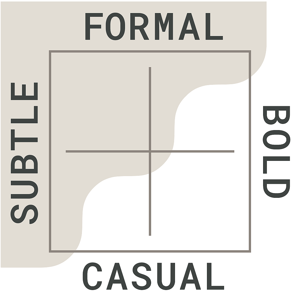
We’ve used the chart to the left to convey a set of example highlighted moods, in this case SUBTLE AND FORMAL. The palette of Stanford Primary and accent colors below reflect a sample suggested color palette.
